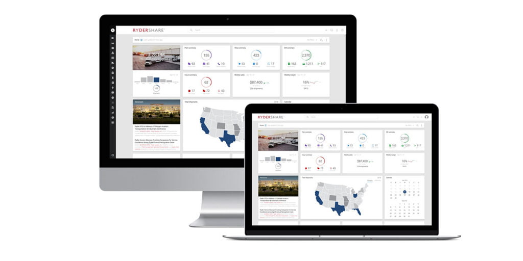


A TMS can have strong optimization, great integrations, and every feature on the checklist, but still frustrate the operation if the UI is fighting the user. In transportation, the interface is not “nice to have.” It is where planning, execution, communication, and billing actually happen. If the UI slows people down, the business pays for it in missed handoffs, avoidable errors, and “shadow work” outside the system.
What “good UI” means in the TMS world
A good UI is not just about looking modern. It is about making the day-to-day workflows easier under real conditions, including constant interruptions.
A good TMS UI tends to do three things well: keep the current state obvious, make the next action easy, and make exceptions fast to resolve. A bad UI hides context behind tabs, forces users to remember fragile click-paths, and makes teams build workarounds in spreadsheets and inboxes.
The fastest way to judge UI: onboarding and exceptions
You can usually tell within a week of go-live whether the UI is helping or hurting.
Bad UI creates “power users” who know the secret routes through the system. Everyone else follows scripts and hesitates to touch anything unfamiliar. Training takes longer, mistakes happen when someone deviates from the script, and even worse, it creates silos where those power users suddenly become indispensable.
Good UI is discoverable. Labels match how transportation teams speak, screens follow the lifecycle of a shipment, and the system makes it hard to do the wrong thing by accident. New users can succeed without a guide standing behind them.
Exceptions are the real test. On perfect days, almost any TMS feels fine. On messy days, bad UI turns exceptions into investigations, with users hunting across screens to piece together what changed and when. Good UI turns exceptions into workflows, surfacing the issue, the impact, and the next best action so teams can communicate quickly and recover.
Hidden costs of bad UI
Bad UI rarely fails loudly. It fails quietly, through friction that compounds:
- Duplicate work because the “real status” lives outside the TMS
- Slower response to customer escalations because context is scattered
- Higher error rates because people are forced to memorize process
- Longer onboarding because success depends on tribal knowledge
Good UI reduces cognitive load on users. It keeps the essentials visible, makes deeper detail easy to reach, and maintains a clean audit trail so anyone can understand what happened without guesswork.
What to ask for in a demo
Do not evaluate UI on a polished happy path. Ask to see one realistic scenario end-to-end: create a shipment, tender it, then handle an exception like a rejection or appointment change. Watch how quickly the platform gets you to the truth, and how few clicks it takes to resolve and communicate.
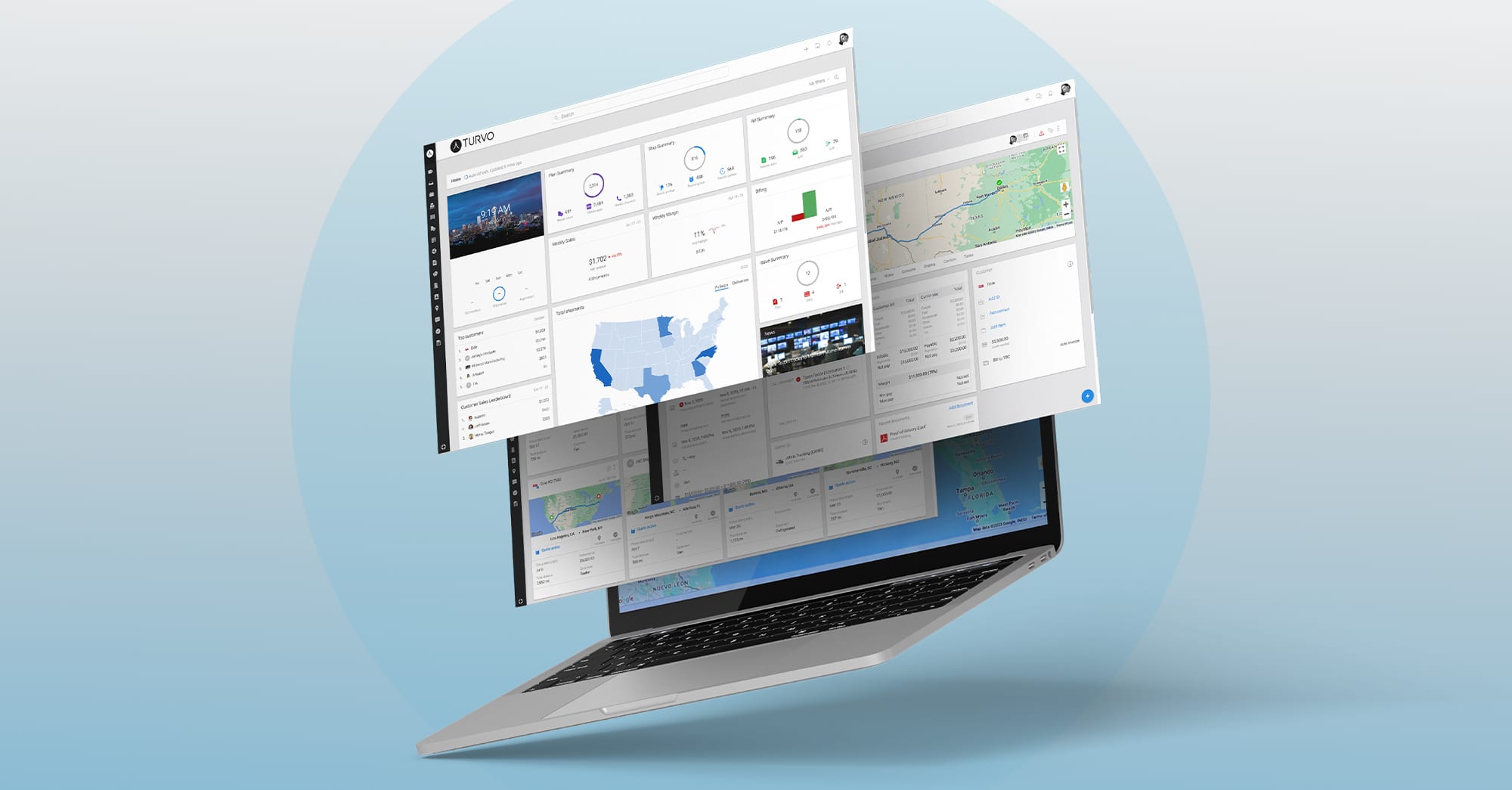
Where Turvo fits
Turvo is built for the reality that transportation is collaborative and exception-driven. The interface is designed to keep teams aligned on a single source of truth while making execution faster, clearer, and easier to learn.
If you want to see what good TMS UI looks like in practice, book a Turvo demo. We’ll walk through the workflows your team runs every week, including the exceptions that matter most, and show how Turvo helps you execute with less friction.