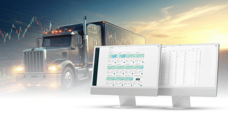

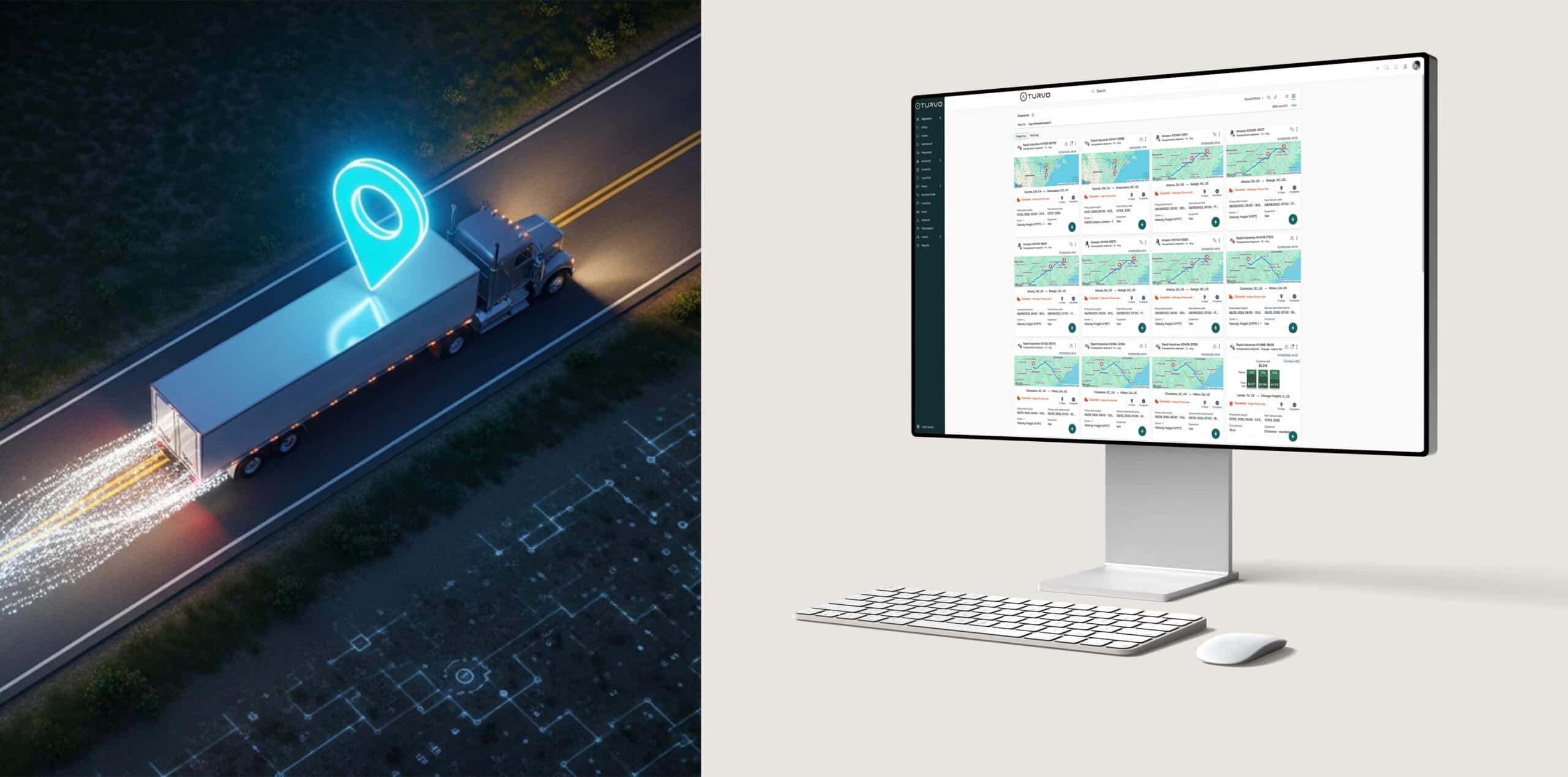
If you walk through the floor of a fast-paced freight brokerage, you’ll likely see two things: high-energy phone calls and desktop screens cluttered with a dozen open tabs, legacy green-screen terminals, and spreadsheet workarounds.
For decades, enterprise B2B software in logistics was built with one goal: store data. User experience was an afterthought. The resulting legacy Transportation Management Systems (TMS) are often functional behemoths—packed with features, yet so clunky that reps actively fight against them.
When adopting a new TMS, the biggest hurdle isn’t server migration or API connectivity. It’s broker adoption. If your software requires a 200-page manual and weeks of training just to cover basic dispatch, your technology ROI is taking a hit before you even go live.
Here is why UI/UX matters so much in modern logistics, and how to choose a TMS that your team will actually enjoy using.
The Hidden Cost of Clunky Enterprise Software
When software is difficult to use, brokers adapt—usually in ways that harm efficiency and visibility.
- Shadow IT and Workarounds: When a TMS takes six clicks and two drop-down menus to update a load status, brokers resort to sticky notes, off-system spreadsheets, or personal messaging apps. The result? Fragmented data that management can’t see.
- Burnout and Turnover: Logistics is already a high-stress industry. Forcing brokers to fight green-screen software or non-intuitive user flows adds micro-frustrations to every hour of their day, accelerating rep churn.
- Slow Onboarding Times: Traditional legacy platforms can take months to train new hires on. In an industry where speed to productivity directly impacts revenue, long ramp times cost real money.
What Consumer-Grade UX Looks Like in a TMS
Modern brokers don’t judge enterprise software against other 20-year-old enterprise systems; they compare it to the apps they use on their phones every day—like Uber, Slack, or Airbnb.
When evaluating a modern TMS, look for these design principles:
1. Single-Pane-of-Glass Visibility
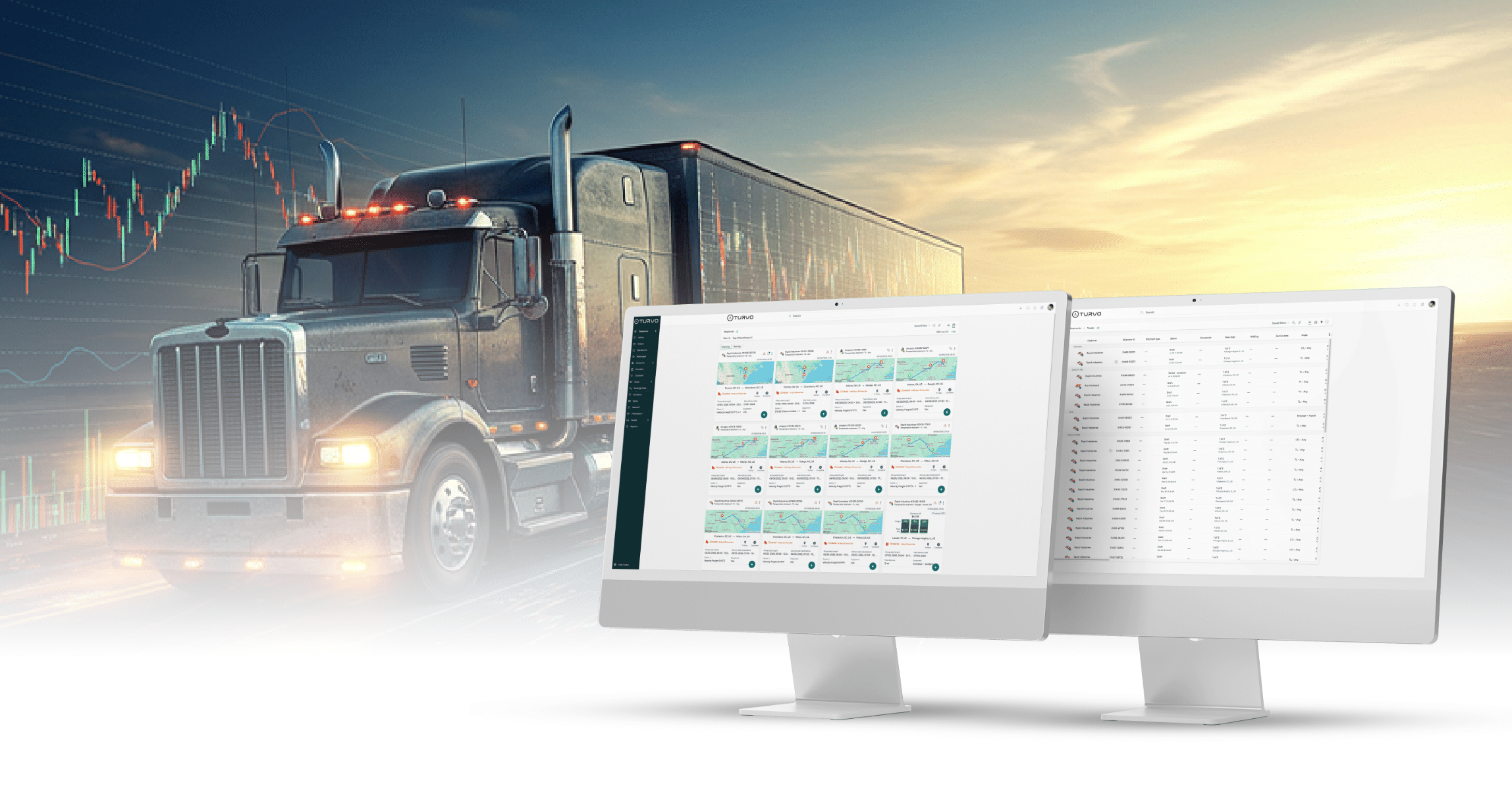
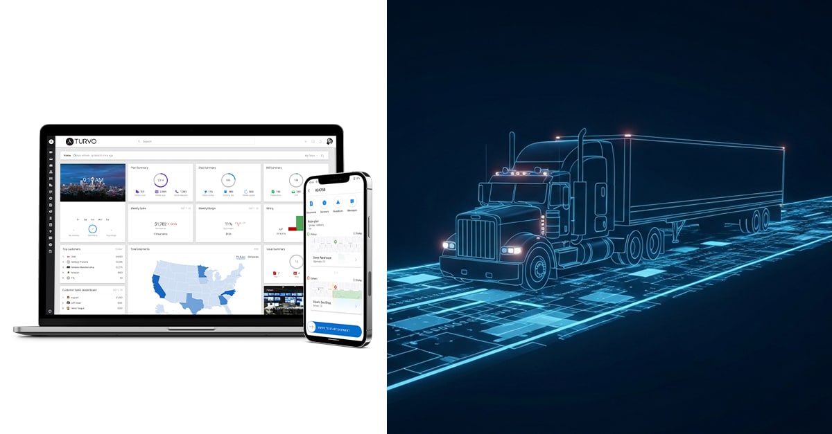
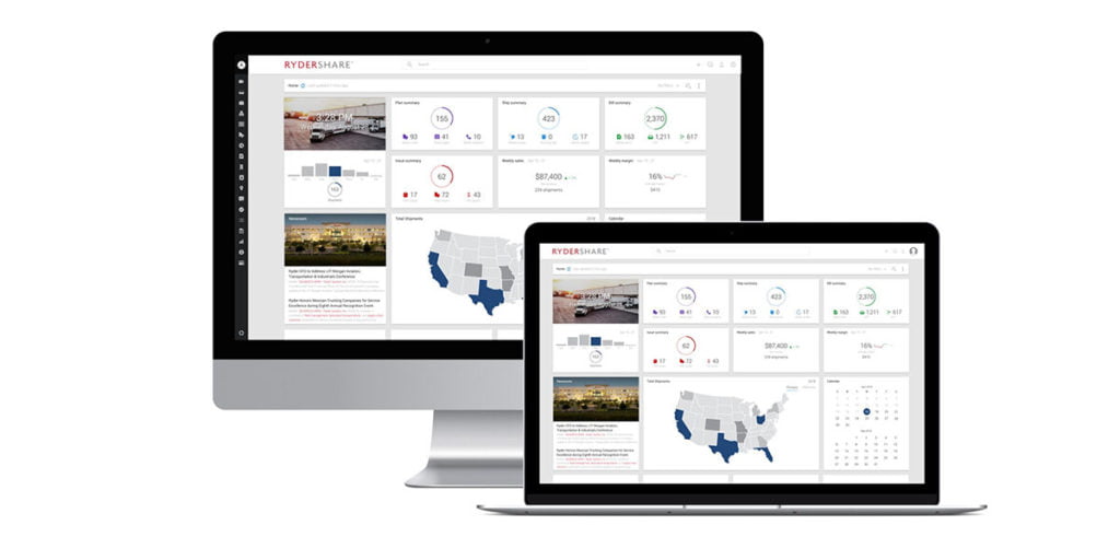
A broker shouldn’t have to open six tabs to check a shipment’s location, view rate history, and look up carrier contacts. The UI should bring all context—tracking data, messages, docs, and financial status—into a single, consolidated view.
2. Contextual Messaging & Collaboration
Rather than switching to external email threads or separate chat tools, top-tier platforms embed communication directly inside the load lifecycle. Tagging a teammate or carrier directly on a load file keeps context intact and eliminates manual “where is this load?” check-ins.
3. Actionable Inquiries over Cluttered Tables
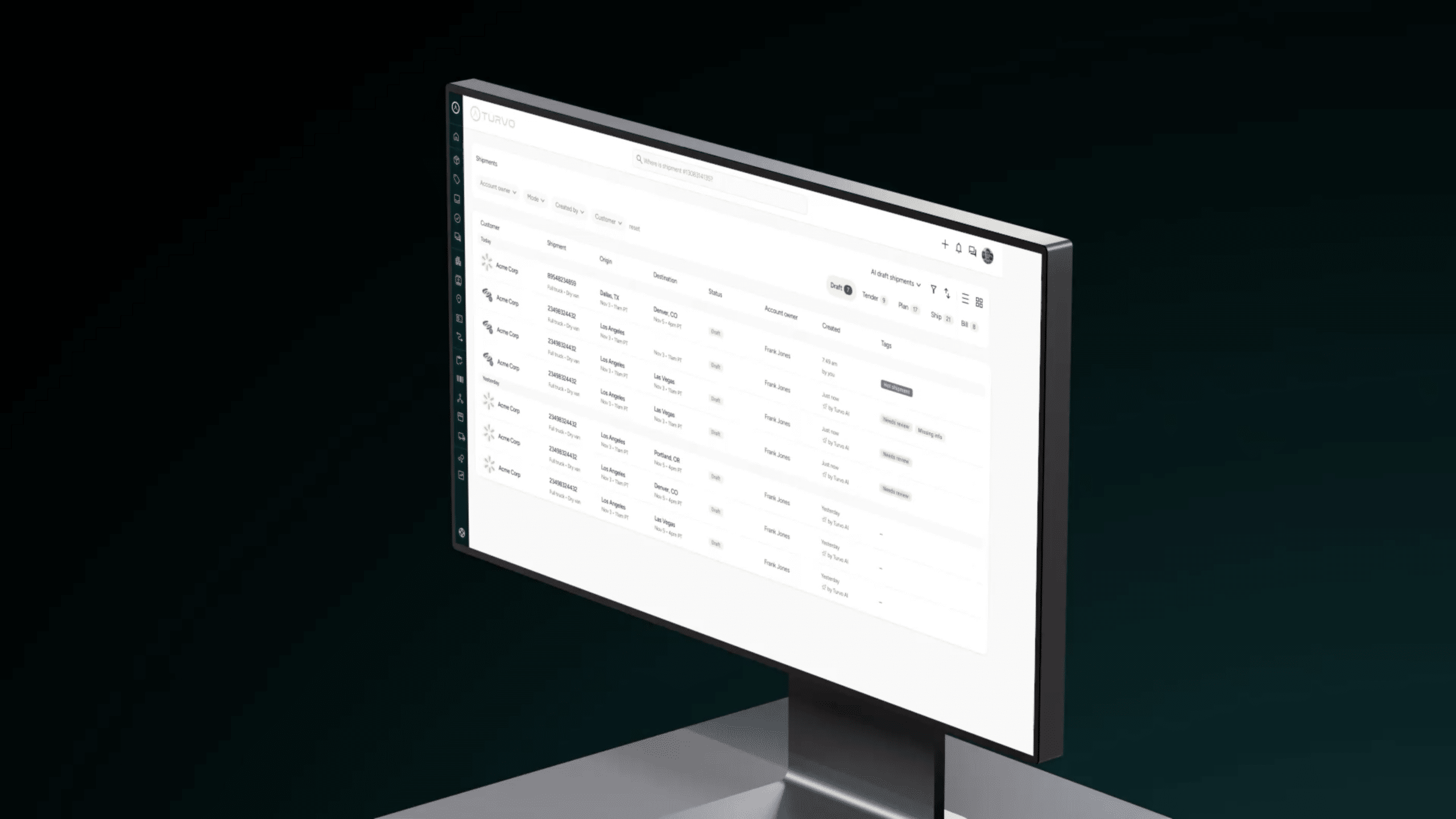
Legacy software bombards users with dense, unformatted tables. Modern UX uses visual hierarchy, color-coded exceptions, and smart filters so brokers can spot delays, temperature spikes, or missing documents instantly.
A Checklist for Your Next TMS Demo
When evaluating new TMS platforms, involve your frontline freight brokers in the demo process and watch how the software handles everyday tasks.
Evaluation Metric | Legacy Red Flags | Modern UX Standards |
Navigation | Deeply nested menus, multi-window clutter | Search-driven, intuitive sidebar, single view |
Onboarding | Requires weeks of formal classroom training | Self-explanatory workflows; intuitive in days |
Exception Handling | Manual check calls to find delayed loads | Visual alerts and automated geofence triggers |
Communication | Disconnected emails, spreadsheets, and sticky notes | In-app messaging contextualized to the specific load |
Ready to streamline your freight settlement process? Request a demo today to see how Turvo can help you connect operations and finance with status-driven workflows.